Applied Graphic Design + Ad Specs
DESIGN PRINCIPLES
Overview
CONSTRAINTS ARE THE WORK.
Applied graphic design isn't the absence of rules — it's operating at the edge of them. Ad specs, brand standards, format requirements, print bleeds, digital safe zones. The work is producing something that functions and still has a point of view inside all of that.
This is the side of the graphic work where someone had an actual brief, an actual deadline, and actual specs. The thinking is the same as the satire. The guardrails are different.
What This Is
Ad creative, brand materials, and spec-compliant design work produced for real clients across the Texas cannabis space, music industry, and independent hospitality — plus foundational design principles that inform everything else.
What This Demonstrates
The ability to operate inside constraints without the work looking like it's trapped inside constraints. Format discipline. Visual hierarchy under pressure. Knowing when to simplify and when the concept needs room.
Design Philosophy
THE FOUNDATION BEFORE THE FORMAT
Before the ad specs, before the brand guidelines, before the deliverable — there's a set of decisions about how things should look and why. Design philosophy isn't abstract theory. It's the set of answers you already have when a new brief arrives.
Hierarchy. Contrast. Restraint. The question isn't what looks interesting — it's what does the work the design needs to do.
The Principle
Visual design that requires explanation has already failed at its primary job. The goal is always legibility — of the message, of the hierarchy, of the intent — even when the aesthetic is intentionally loud.
ACL Inspiration
AUSTIN LOCALS IN CITY LIMITS.
Two poster concepts built in the visual language of Austin City Limits festival artwork — applied to Austin artists I actually care about. Gary Clark Jr. and the Butthole Surfers share almost nothing sonically, but they share a city, a cultural weight, and enough iconographic material to hold a poster system.
The ACL style from a few years back had a formula worth studying: tall condensed all-caps type, desaturated portrait cutouts, hard-limited palettes, thick framed poster fields, and tiny utility text treating the poster like a document. No clutter. No overworked texture. The strength lives entirely in the composition.
The System
The exercise wasn't to make two separate posters — it was to apply one rigid visual system to two completely different artists and prove the system holds. Same structural rules. Same palette discipline. Same typographic hierarchy. Different subjects, different energy, same family.
Pick a strong silhouette. Desaturate it. Limit the palette to three or four colors with one loud pop. Set the name huge in condensed sans-serif. Add small utility text as a structural detail — date, city, a code. One background move. Keep it flat. That's the whole recipe.


↑ Click any image to enlarge
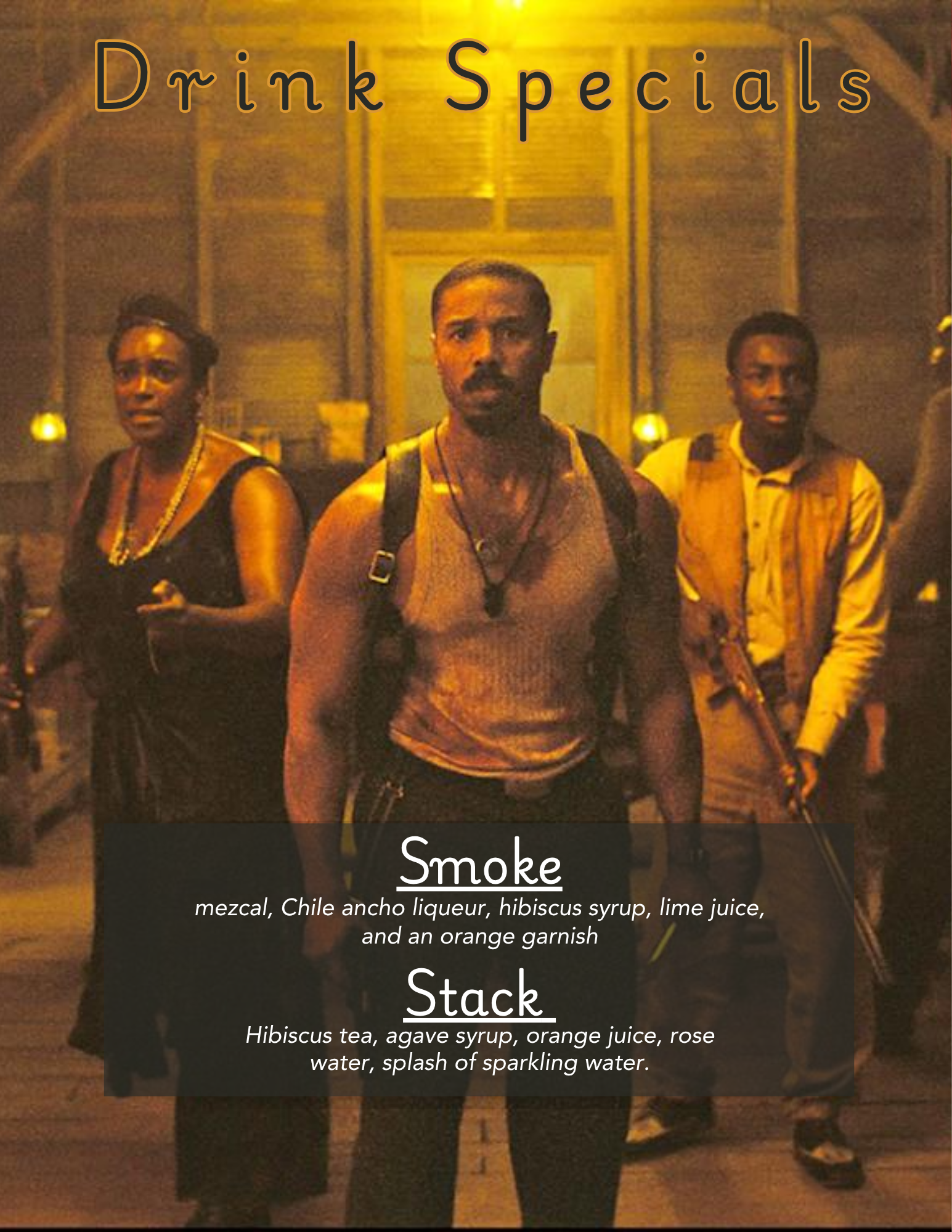
Sinners — Drink Specials
HOSPITALITY CREATIVE WITH AN EDGE
Hospitality design has one primary function: get the customer in the door, or keep them at the bar. The visual register has to match the venue. A Hyper Real aesthetic for drink specials isn't decoration, it's positioning. This place is a specific kind of place, and the creative says so before the copy does.
The Execution
Drink special creative for Sinners — Created for Hyper Real showing visual treatment, bold hierarchy, and a tone that earns attention in a crowded social feed without looking like every other bar graphic on Instagram.
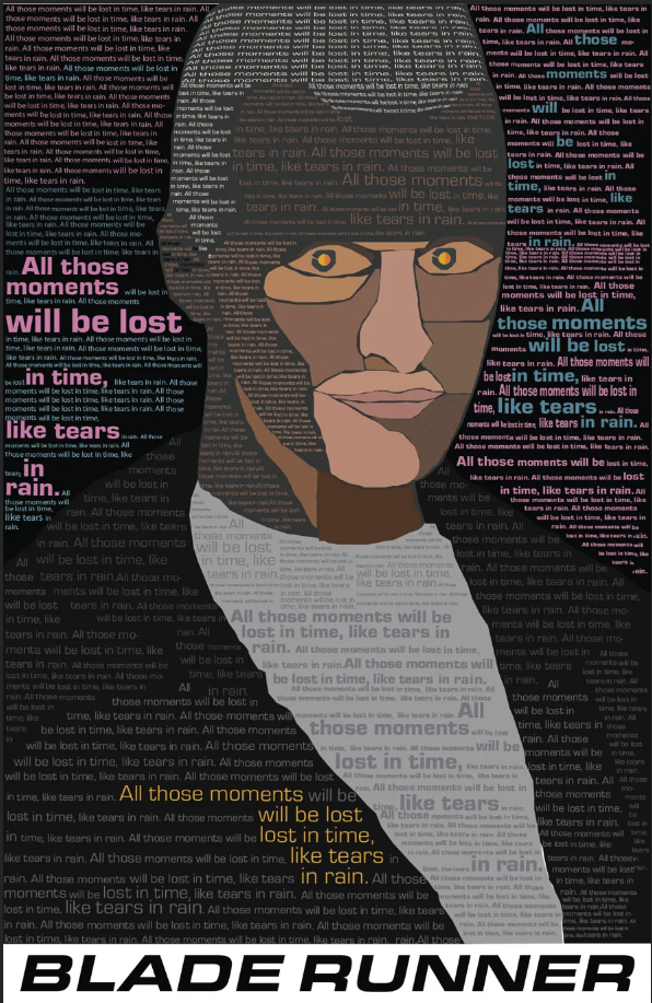
Blade Runner — Typography Portrait
CONSTRUCTED FROM THE ONLY TOOL HE HAS LEFT
Roy Batty is literally built from language itself. This typography portrait uses the full text of the Tears in Rain monologue as the material substance of his face. Every shadow, every contour, every gradation of light is constructed from the speech about experiences no one else can witness and no one can inherit.
The piece mirrors Roy's constraint: he cannot transfer lived experience directly. All he has are words and images — the most basic building blocks of art. So that is exactly what he is made from.
The Meta-Layer
The form and the content are doing the same work. Roy's last act is to create art in the face of erasure — to compress an entire lifetime of extraordinary experience into a few sentences before the light goes out. The poster doesn't illustrate that idea. It is that idea.
The impossibility of truly sharing experience except through art becomes the structural logic of the design itself.
Technical Execution
Built entirely in Adobe Illustrator using manually placed and adjusted text blocks. Typographic density, scale, opacity, and color create volumetric shading and form without any underlying image visible in the final piece. The glowing eyes are the sole graphic element — a direct reference to the iris glow used in the film to identify replicants during the Voight-Kampff test. Manual placement over automatic text wrap to maintain precise control over how language builds the face. That control is load-bearing to the concept.
Context
Presented in a media design class to an audience largely unfamiliar with the film. The piece landed flat — which turned out to be its own version of the theme. Roy's monologue is about having witnessed things no one else can fully receive. The poster about that experience was received by a room that couldn't receive it.
The students were Deckard. The work was Roy.
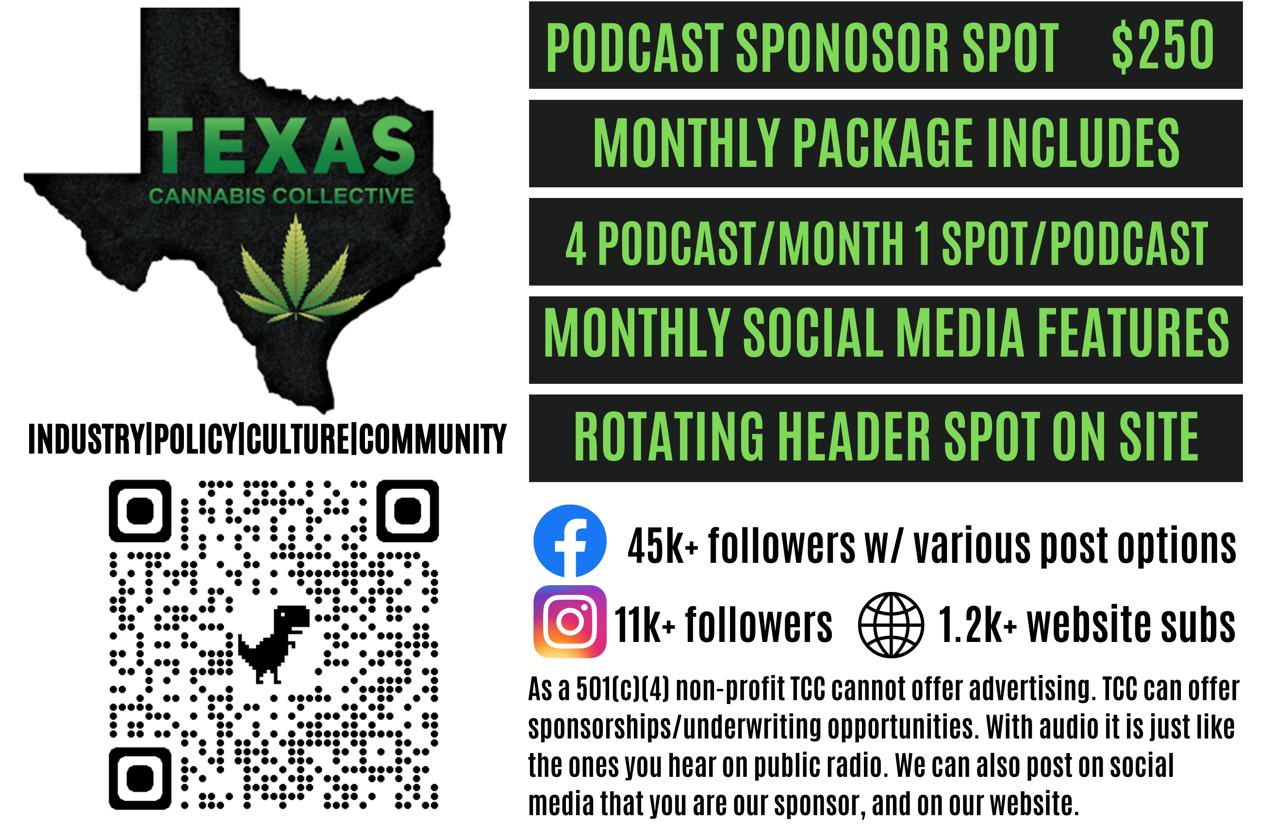
TXCannaCo — Podcast Sponsor Spot
AUDIO-FIRST BRAND, VISUAL EXECUTION
Podcast sponsorship creative requires translation — taking a brand that lives primarily in audio and giving it a visual presence that works across digital placements, episode graphics, and promotional materials without losing the audio-first brand identity.
The Context
TX Canaco podcast sponsor spot designed to support media placements across the Texas cannabis advocacy space. Clean enough to be credible, pointed enough to be noticed.
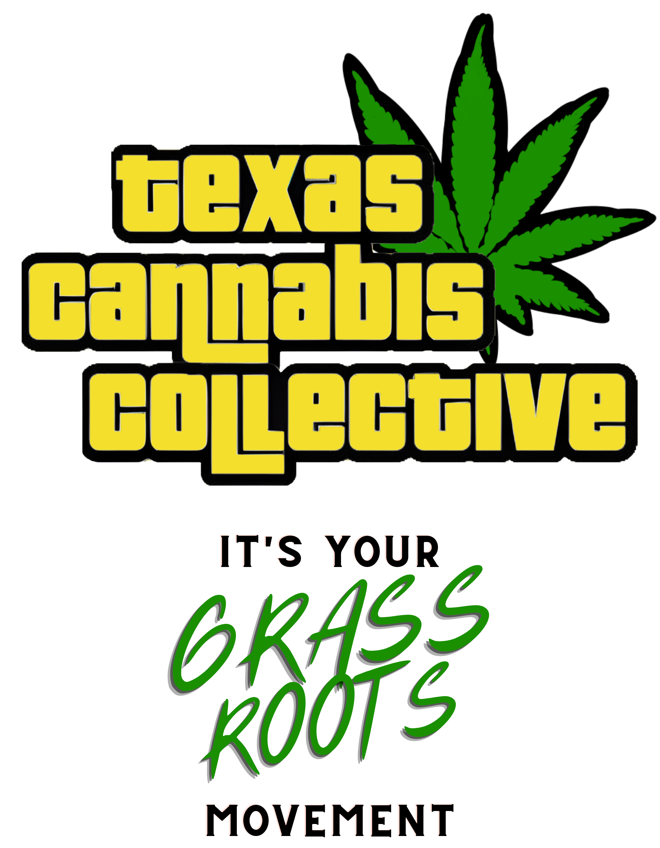
Grassroots
ADVOCACY DESIGN HAS DIFFERENT RULES
Advocacy and grassroots campaign design operates under a different set of constraints than commercial work. The audience is already motivated. The visual job isn't to create desire — it's to create clarity, urgency, and a sense that the organization behind the material knows what it's doing.
Credibility is built before trust is asked for. The design can't undermine either one.
The Approach
Grassroots campaign materials designed to communicate clearly under conditions where the audience is skeptical by default. Clean hierarchy. Unambiguous messaging. Visual credibility that earns the ask.