Editorial Design
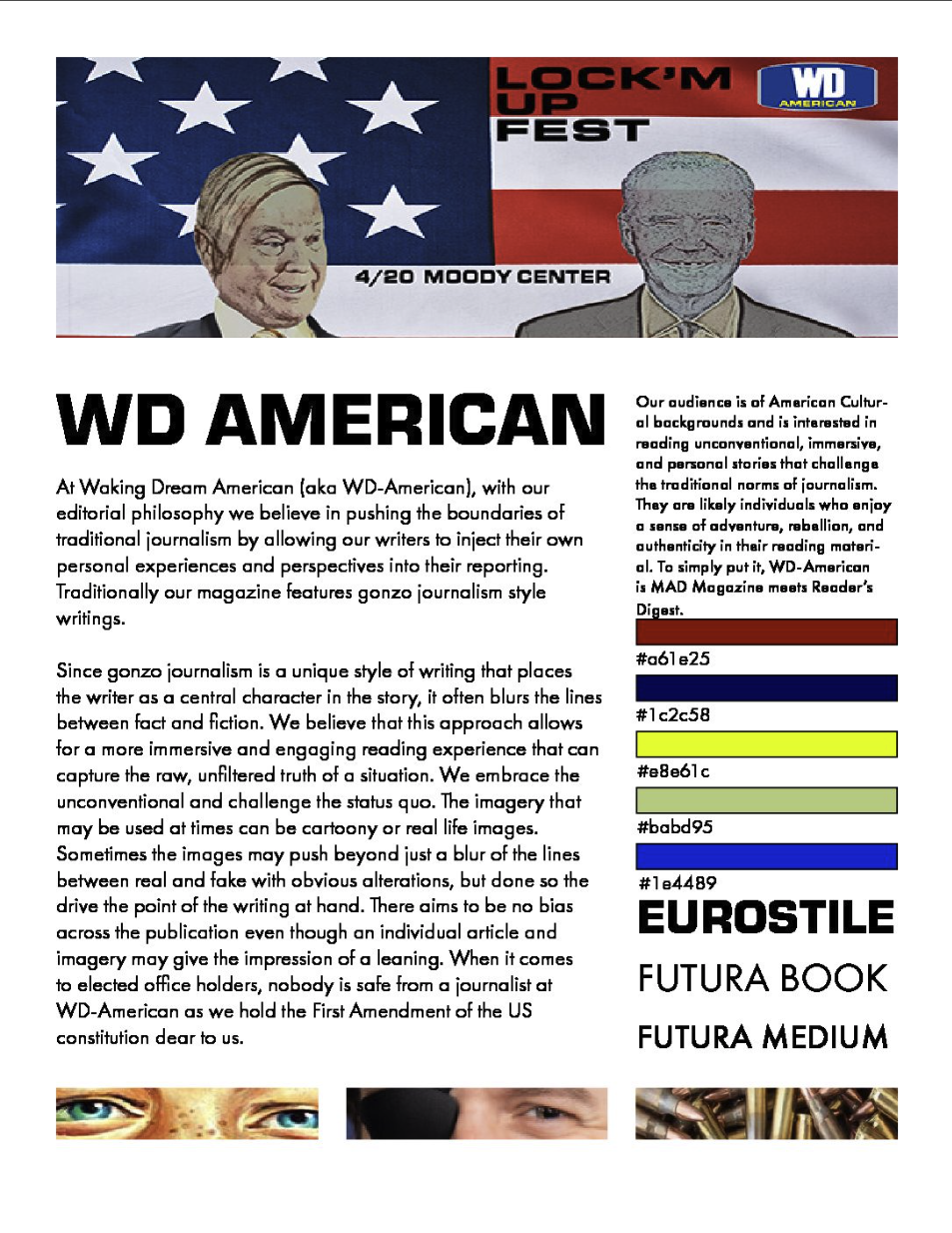
WD-AMERICAN
Overview
TABLOID IRREVERENCE MEETS MAINSTREAM READABILITY
WD-American — full name Waking Dream American — is a self-directed print publication concept built around a gonzo journalism design philosophy. The premise: what happens when you treat tabloid irreverence and mainstream readability as a single design problem instead of opposing forces?
A Unique Philosophy
The publication's name, voice, editorial concept, and visual system were original conceits — not prompts, not briefs. The target reader was someone who craves adventure, rebellion, and authenticity in their reading material — underserved by both the mainstream press and the alternative press simultaneously.
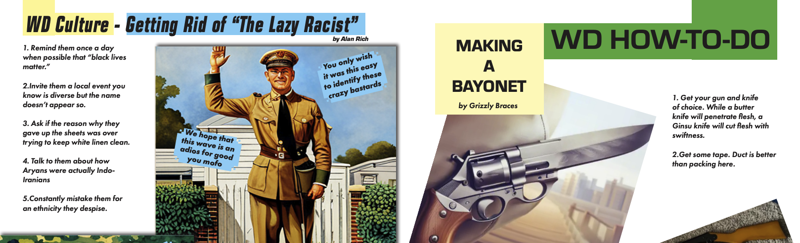
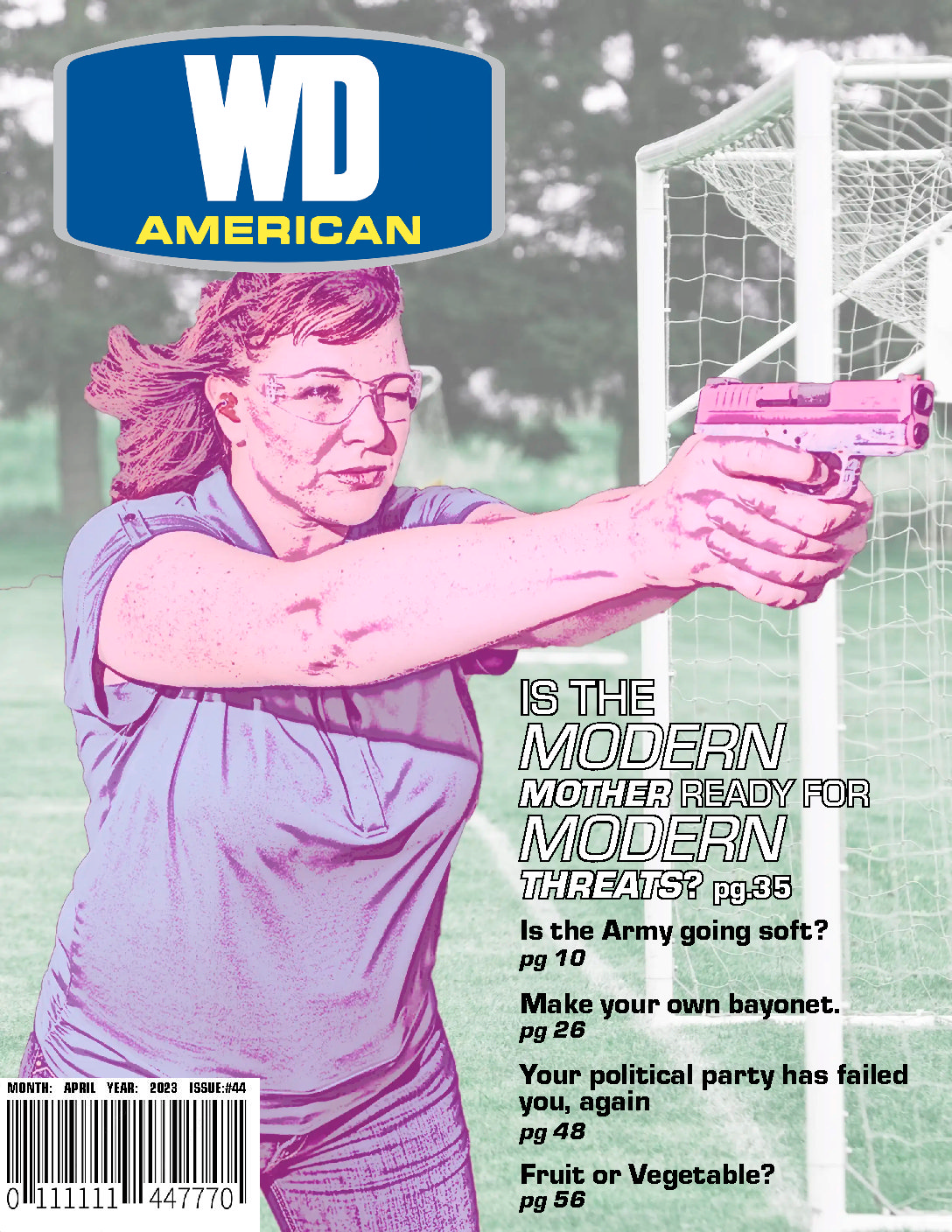
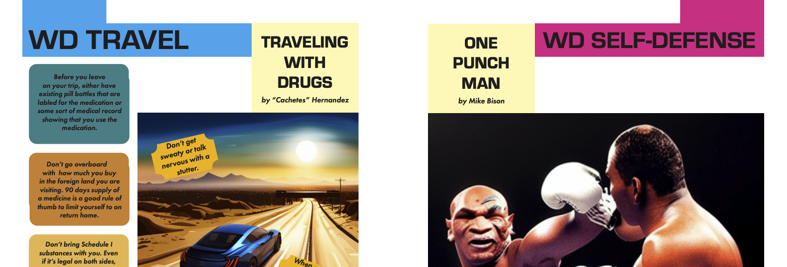
A full layout system built from scratch across 10+ pages, with a defined color palette, Eurostile-led typography system, and an editorial philosophy that held gonzo subjectivity and zero-bias political coverage as equally non-negotiable. Nobody is safe. That's not a tagline — it's a design constraint.
Editorial Philosophy
The Design System
BUILDING THE GRID BEFORE BREAKING IT
Every layout decision in WD-American starts from a documented design philosophy — not intuition. The grid exists to be violated deliberately, not accidentally. Full-bleed title spreads, multi-column article layouts, and controlled typographic chaos that still guides the eye.
The challenge: make it feel unhinged enough to be interesting and structured enough to be read. That tension is the point.
Gonzo journalism places the writer as a central character — blurring the lines between fact and fiction to capture the raw, unfiltered truth of a situation. WD-American embraces the unconventional and challenges the status quo. That philosophy isn't just editorial. It's structural. Every design decision either serves that premise or gets cut.
Typography
Type choices were driven by editorial character — display faces that carry tabloid energy, body type that doesn't fight you on a long read. Hierarchy that works at a glance and rewards closer reading. Eurostile leads. Futura follows.
Spreads
Full-bleed spreads were treated as single compositional units, not two facing pages. Image, type, and whitespace work across the gutter rather than stopping at it.
Color
A deliberate palette built to feel American without feeling safe — deep red, navy, acid yellow, and muted olive. Nothing aspirational. Everything intentional.
Imagery
Imagery can be cartoony or photographic. Sometimes images push beyond the blur between real and fake with obvious alterations — done deliberately to drive the point of the writing at hand. There is no bias across the publication even though an individual article or image may give the impression of a leaning. When it comes to elected officeholders, nobody is safe. WD-American holds the First Amendment dear.
Editorial Concept
THE NAME IS THE BRIEF
WD-American didn't start with a client or a category. It started with a voice — specifically, what a publication would sound like if it took working-class American culture seriously without either celebrating or condescending to it.
The conceits — and yes, that word is intentional — were never assigned. The name, the reader psychology, the editorial stance, the visual system, the political philosophy: all original. No prompt, no client brief, no template. A designed thing that knows exactly what it is.
The gonzo journalism framework gave the design permission to be loud where most editorial design is restrained. The Reader's Digest influence kept it from becoming unreadable. The tension between those two forces is not a compromise — it is the concept.
Why It Matters
Most editorial design projects demonstrate craft. This one demonstrates editorial judgment — the ability to define a publication's reason for existing and then build a visual system that serves that reason.
The concept, the name, the voice, the layout approach: all original. No prompt, no client brief, no template. A designed thing that knows what it is.
Editorial Concepting & Narrative Architecture
THE DEPTH OF THE JOKE
The Rabbit Hole Is the Feature
A serious article might hide a punchline three paragraphs deep. A silly one might land a genuine political point in the final sentence. The reader never quite knows which they're in — and that uncertainty is the engine that keeps them going.
The working websites for the ad and the Latin filler text — which most publications treat as meaningless placeholder — contains real sentences and will take people to real websites making real observations about current events and pop culture. Nobody has to read it. Nobody grades it. But if you do, the rabbit hole goes somewhere.
This is the level of commitment the philosophy required. Not just the cover, not just the headlines — all the way down to the margins.
Editorial Concepting & Narrative Architecture
THE REACTION
THE SPLIT WAS PROOF OF CONCEPT
Half the focus and feedback group dismissed it as bad design and bad writing. The other half immediately recognized it as exactly two insanely different things — Mad Magazine and Reader's Digest — somehow occupying the same space at the same time.
That split reaction wasn't a failure of execution. It was the concept working exactly as designed. Gonzo journalism has always sorted its audience. The readers who get it can't stop. The readers who don't think something has gone wrong.
The Difference It Makes
Most editorial design projects demonstrate craft. This one demonstrates editorial judgment — the ability to define a publication's reason for existing and then build a visual system that serves that reason completely.
Added context
Built during a month that included having COVID with lung failure followed a house fire. The publication was produced and demonstrated anyways. That leads to another fun story and study to look at in this portfolio of work.