Product Design + UX Research + Figma Prototype
KINDRED
Overview
THE PROBLEM WAS IN THE FORUM DATA
Bumble BFF had a user trust and friction problem. Forum data told the story clearly — real users describing real failure points in a platonic social connection app where safety, authenticity, and ease of use were all breaking down simultaneously.
View the Prototype
Kindred is a functional Figma Make prototype built to address those specific failures. The research came from synthesized user complaint data. The design decisions came from that research. The prototype is functional enough to demo the full behavioral system — not a mockup, not a concept board.
Two goals: demonstrate product problem-solving from evidence to execution, and demonstrate Figma Make proficiency at a level beyond surface familiarity. Not a click-through mockup. A functional prototype with real interaction logic.
The Problem
BUMBLE BFF WAS BREAKING DOWN IN THREE PLACES
Forum data from real Bumble BFF users surfaced a consistent pattern of complaint across three interconnected failure modes: trust, authenticity, and friction at the connection point.
Users didn't feel safe meeting strangers. The profile format didn't allow enough signal to make informed decisions. And the moment of actually reaching out — the transition from interest to contact — required more social risk than the platform had earned.
Trust
Platonic connection requires a different trust architecture than dating. Bumble BFF was using the same verification and safety model as its dating product — which was designed for a different risk calculus entirely.
Authenticity
Profile formats that work for dating — photo-forward, surface-level bios — don't generate enough signal for platonic matching. Users couldn't tell whether someone was actually compatible before initiating contact.
Friction at the Moment of Connection
The gap between "interested" and "reaching out" was too wide. The platform asked users to take social risk before providing enough information to make that risk feel reasonable.
Research Foundation
WHAT THE DATA SAID BEFORE DESIGN BEGAN
Synthesized insights from public community discussions revealed five systematic failure patterns across existing friendship platforms.
Loss of Preference Control
Users report diminished agency over matching criteria and visibility settings — the platform decides what matters, not the user.
Low Conversation Reciprocity
Asymmetric engagement patterns create frustration and abandonment. One person is always doing more work than the other and the system doesn't acknowledge it.
Ghosting and Initiation Anxiety
High-friction initiation paired with low response rates deters authentic engagement. The ambiguity around acceptable message frequency creates anxiety that existing platforms do nothing to address.
Misaligned Intent
Platform misuse blurs the boundary between platonic and sexual interaction contexts. The app says friendship. The behavior says otherwise. The system has no mechanism to reconcile them.
Shrinking Third Spaces
The decline of physical community venues increases reliance on digital intermediation — which means the stakes of getting online connection right are higher than they've ever been.
Key Research Insights
SIX FINDINGS THAT SHAPED EVERY DESIGN DECISION
01 — Users want filtering clarity.
Explicit control over visible criteria reduces cognitive load and trust uncertainty. People want to know what the system is doing with their information.
02 — Users struggle with message initiation pacing.
Ambiguity around acceptable response times and message frequency creates anxiety on both sides of a conversation. The platform should hold that tension, not leave it to the users.
03 — Users feel uncertainty about real-world meetup safety.
Lack of contextual information about meeting environments inhibits the transition to offline connection — which is the actual goal of a friendship app.
04 — Safety guardrails must exist without feeling punitive.
Friction should feel protective rather than patronizing or accusatory. The moment moderation feels like punishment it stops working.
05 — Discovery volume doesn't equal quality connections.
Users prefer fewer, better-aligned matches over high-volume low-context suggestions. More profiles is not more value.
06 — Intent signaling reduces ambiguity.
Clear declaration of platonic boundaries eliminates uncomfortable misinterpretation before it starts.
The Approach
RESEARCH FIRST. DESIGN DECISIONS SECOND. PROTOTYPE THIRD.
The design process followed the evidence. Forum data was synthesized to identify recurring failure patterns — not isolated complaints, but structural problems that appeared consistently across user accounts.
Each design decision in Kindred maps directly to a documented failure point. This isn't a rebrand of Bumble BFF. It's a response to the specific ways Bumble BFF breaks down for its users.
The Research Method
User complaint data from forums, reviews, and community discussions was synthesized and categorized. Patterns were identified. Failure modes were ranked by frequency and severity. The design brief wrote itself.
The Design Decisions
Kindred addresses each failure point directly: richer profile formats that generate more signal before contact, lower-friction connection mechanics that reduce social risk, and a trust architecture built for platonic connection rather than borrowed from a dating product.
The Design Philosophy
FOUR PRINCIPLES THAT DROVE EVERY DECISION
Trust architecture over surface-level UI.
Safety isn't a modal. It's the structure of the interaction itself — when messages send, when they don't, what happens when someone pushes a boundary, and how the system responds without shaming or gamifying the violation.
Safety embedded in interaction patterns, not posted in a terms page.
Every friction point in Kindred is designed to slow down bad behavior without punishing good-faith users. The system reads behavior, not just content.
Reducing social anxiety without surveillance.
No compatibility scores. No popularity metrics. No public violation counters. The internal sorting logic is invisible to users — because showing people how they rank against each other creates performance anxiety that kills authentic connection.
Intent integrity over interest overlap.
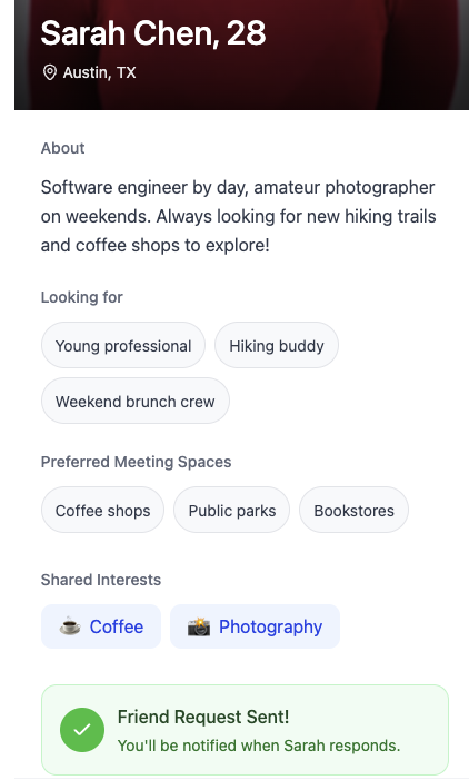
Shared interests are a starting point, not a compatibility guarantee. Kindred uses intent tags and Third Space comfort zones to match people on what kind of connection they're actually looking for — not just whether they both like hiking.
System Architecture
FIVE LAYERS. ONE COHERENT TRUST SYSTEM.
Every interaction in Kindred passes through five architectural layers, from the ground up. Each layer informs the ones above it. The moderation layer doesn't operate in isolation — it reads signals from intent, third space, and interaction simultaneously.
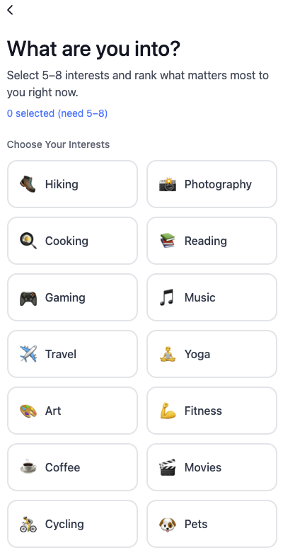
Identity Layer
Core profile and interest taxonomy. Who you are.
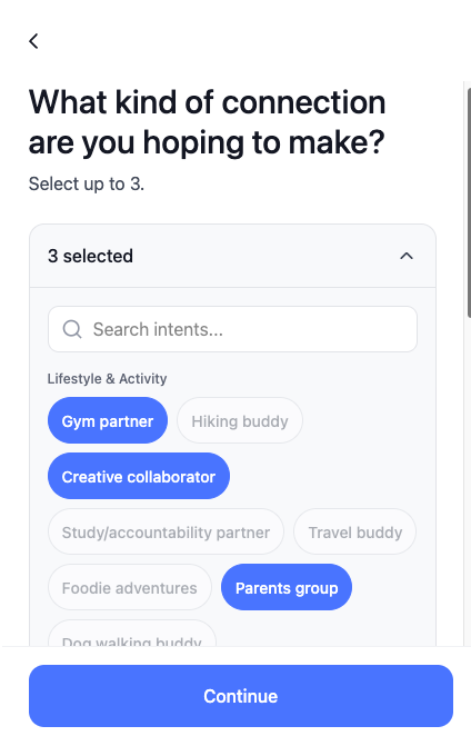
Intent Layer
Explicit declaration of connection goals. What you're looking for.
Third Space Layer
Meeting context preferences and venue comfort zones. Where you're willing to go.
Interaction Layer
Message pacing and response quality signals. How you engage.
Moderation Layer
Behavioral pattern detection and tiered friction. What happens when the system detects misuse.
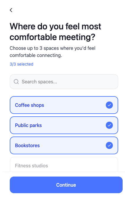
The Onboarding System
BUILDING THE TRUST SIGNAL FROM THE FIRST SCREEN
Onboarding in Kindred is designed to collect behavioral signals without feeling like an interrogation.
Gender selection, interest ranking, intent tags, Third Space comfort zones, and profile basics are gathered in sequence — but the ranking logic behind interests is internal only. Users never see priority numbers or badges. Shared interests display as neutral tags. The system knows more than it shows, and that asymmetry is intentional.
Discovery Settings
Distance radius filter on a 5–50 mile slider, toggleable off entirely. Sorting logic runs on ranked interests, intent alignment, Third Space signals, and response rate history — none of it visible to the user as a score or metric.
What the Onboarding Isn't
No compatibility percentage. No swiping mechanics. No infinite scroll. The onboarding isn't asking who you are. It's learning how to find you the right match without telling you how it's doing it.
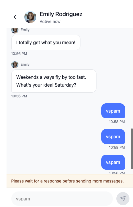
The Spam Friction System
BEHAVIOR-BASED. NOT REPORT-BASED.
Most platform safety systems wait for a report. Kindred intervenes before the damage is done.
A rolling 25-minute window tracks message behavior. After three consecutive unanswered messages the input locks with an inline message: "Please wait for a response before sending more messages." The counter resets on reply received. No public strike counter. No shame. Just friction that slows down the pattern before it becomes harassment.
A global first-chat notice — non-dismissible until the first reply is received — sets behavioral expectations at the moment they matter most, not buried in onboarding.
Detection Signals
The system monitors across all interactions:
- Identical or template messages
- High initiation / low response ratio
- Rapid sequential messaging
- User reports from multiple sources
Consistency
The system applies consistently regardless of gender. The friction is architectural, not discretionary.
The Tiered Moderation System
THREE TIERS. ZERO GAMIFICATION.
The philosophy across all three tiers: calm, non-punitive, instructional. The goal is correction, not punishment. Gamified moderation creates shame spirals and appeals, not behavior change.
Intent Mismatch Flag
If a user selected Gym Partner, Study Buddy, or Networking as their intent and sends explicit sexual content — immediate Tier 2 escalation, internally flagged as an Intent Mismatch. Not visible to the user. Visible to the moderation system.
Tier 1 — Suggestive language detected
Message sends. Inline banner appears: "Kindred is designed for respectful friendship-building." Informational, non-blocking, non-punitive.
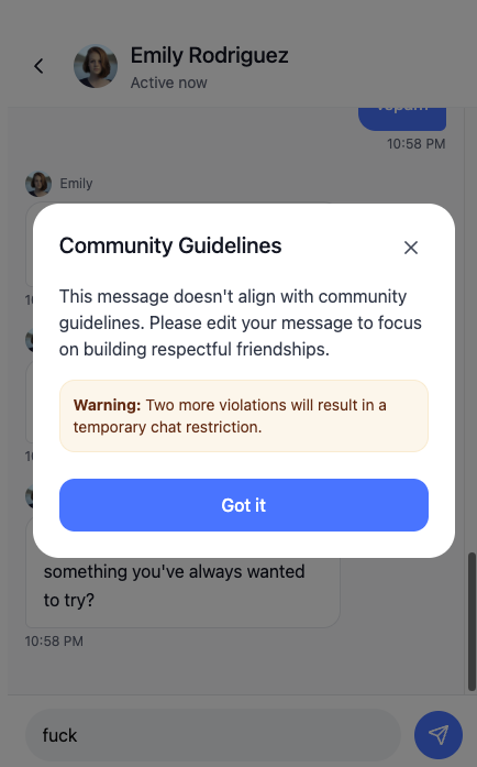
Tier 2 — Explicit sexual language
Message blocked. Modal appears: "This message doesn't align with community guidelines." User must edit before sending. No public record.
Tier 3 — Repeated violations
Three blocked attempts within ten minutes triggers a ten-minute chat lock. Calm, instructional language. No public strike counter shown.
Tradeoffs & Risks
WHAT THIS SYSTEM MIGHT GET WRONG
No system design is without constraints. These are the anticipated failure modes — documented before shipping, not discovered after.
Over-Moderation Risk
Overly aggressive friction may penalize legitimate users with poor early luck — low response rates in a sparse network creating false negatives that damage trust before the platform has earned it.
False Positives
Pattern detection may misclassify behavior, particularly for neurodiverse communication styles or cultural differences in messaging cadence and frequency.
Friction vs Autonomy Balance
Users may perceive protective measures as infantilizing, particularly if message delays feel arbitrary rather than clearly explained. The line between protective and patronizing is thin and context-dependent.
Network Effects Barrier
Quality-focused matching requires critical mass. Early adoption may feel sparse — fewer matches, slower conversations, lower perceived value before the system has enough users to demonstrate its advantages over volume-based alternatives.
Hypothesized Outcomes
WHAT SUCCESS LOOKS LIKE AND HOW TO MEASURE IT
If research-informed design principles are successfully implemented:
↑ Increased Reciprocity
Intent alignment and pacing controls should improve response rates and conversation quality — fewer one-sided exchanges, more sustained back-and-forth.
↓ Reduced Spam Initiation
Behavioral friction disincentivizes high-volume low-effort outreach patterns without requiring users to report them first.
↑ Greater Trust Perception
Meeting context preferences and moderation visibility increase perceived safety — users feel the system is working for them, not just monitoring them.
↑ Offline Transition Rate
The Third Space layer reduces logistical and psychological barriers to in-person meetings — which is the actual outcome a friendship app should be optimizing for.
Success metrics for this system must extend beyond engagement rates to include durable connection formation, offline meetup conversion, and sustained reciprocity patterns. Engagement without connection is the problem Kindred was built to solve.
The Prototype
FUNCTIONAL. NOT A MOCKUP.
The Figma Make prototype demonstrates the core interaction model with real logic — not a click-through wireframe. The key flows are navigable and the design decisions are visible in how the interactions work, not just how they look.
Figma Make allows interaction logic that standard Figma prototyping doesn't — conditional behavior, state management, dynamic content. Using it at this level is a demonstration of proficiency, not just familiarity with the tool.
The moderation system, spam friction, and intent mismatch logic all function in the prototype. The behavioral systems are demonstrable.
View the Prototype
What It Demonstrates
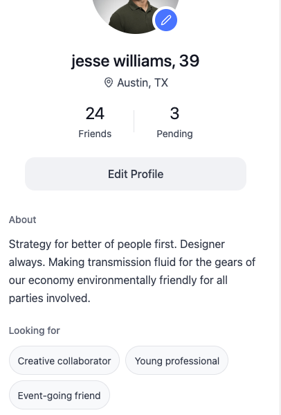
The profile view represents the authenticity solution — a richer format that surfaces meaningful signal before any social risk is required. The user has enough information to make a real decision before they have to make a move.
Reflection
PRODUCT THINKING FROM EVIDENCE TO EXECUTION
Kindred demonstrates the full arc: identify a real problem in an existing product through user research, translate that research into specific design decisions, and build a prototype that validates those decisions with enough fidelity to demo.
Designing connection systems requires balancing growth incentives, safety mechanisms, and behavioral psychology. The tension between scale and quality is inherent to social infrastructure. Platforms optimized for rapid user acquisition often sacrifice the friction necessary for trust calibration.
The Decisions That Matter
The decisions that make Kindred work aren't visual decisions. They're behavioral architecture decisions — what the system allows, what it slows down, what it blocks, and how it communicates each of those moments to the user without creating anxiety, confusion, or shame.
The Transfer
The medium is consumer social. The discipline is the same one used in T-PHEDS — product thinking applied to a real problem, built out to the point where the solution is visible and testable. Different stakes. Same rigor. The skill demonstrated here — synthesizing user research into product decisions — is not medium-specific. Understanding why a product fails for its users, then designing the specific intervention that addresses the failure, is the work. The platform is just the context.